
The Image Being Adjusted
Keep the source subject and arrangement as the starting point for the request.
The Color Matcher guides a source image toward the color feel of a reference. Give the Pexo AI video agent both images and describe the warmth, contrast, saturation, or overall palette you want, along with any product or skin colors that should remain believable.
Source and reference
Label the source to adjust and the reference supplying the palette.
This image workflow concerns color appearance, not physical paint matching or certified color measurement.
What it is
A color matcher uses one image as a guide for the appearance of another. The reference can suggest a warmer balance, cooler shadows, softer contrast, or a more restrained palette without asking to replace the source subject.
Choose a reference with lighting and contrast that make sense for the source. A dark night scene and a bright product photograph may not translate directly. Name the cues you want to borrow and the colors you cannot afford to distort.
Keep the source subject and arrangement as the starting point for the request.
Identify the palette, warmth, saturation, or contrast that should guide the change.
Flag skin, brand colors, and product finishes that should not follow the reference too strongly.
Agent decisions
Describe the color relationship you want instead of relying on “make these match” alone.
01 / Reference Palette
Identify dominant hues and their relationship without importing unrelated reference subjects.
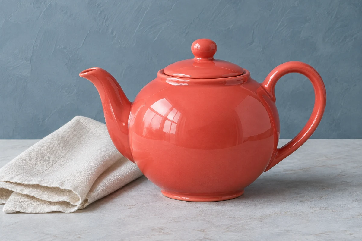
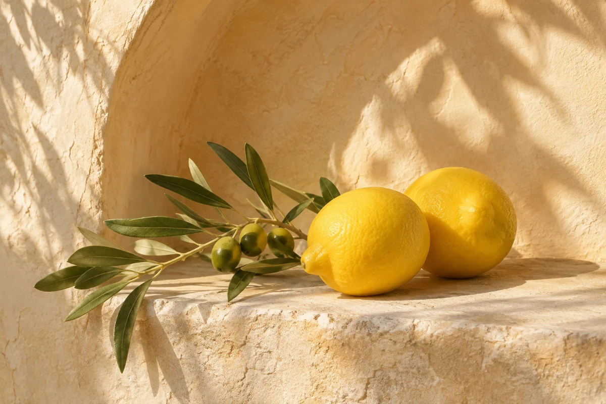
The teapot is the source subject. The reference contributes warm cream, honey-colored light, and muted greens; its lemons and olive branch should not be added to the product scene.
02 / Warmth and Coolness
Describe the overall cast and whether highlights or shadows need a different balance.
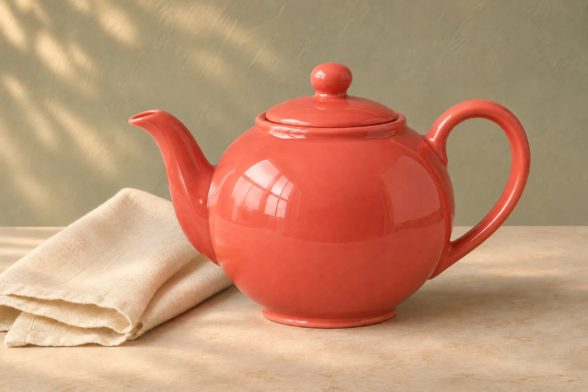
The intended difference is in the surrounding color feel and highlights. The coral teapot remains the visual anchor rather than following every reference hue.
03 / Contrast and Saturation
Guide the strength of dark-to-light separation and color intensity rather than changing every image feature.
A useful direction names the balance: softer separation, warm highlights, and a quieter background. Compare the table and linen as well as the dominant product color.
04 / Protected Color Review
Inspect skin, white surfaces, product finishes, and brand marks that a strong palette change could distort.
Keep the source beside the result when color matters. A pleasing overall palette is not enough if the product finish or a recognizable shape has drifted.
AI-generated color-direction examples. Visual comparisons are illustrative, not calibrated color measurements or a Pexo product test.
How it works
Assign the two image roles and name the color cues before reviewing the adjusted result.
Upload both images. Say which one should change and which should guide its colors; a reference is not an instruction to copy its people, objects, or composition.
Identify warm highlights, muted greens, cool shadows, or another visible cue. Use Image to Image for broader structural edits, keeping this request focused on color.
Compare the result with both inputs. In product work, apply the same shape-and-label checks used with AI Product Image Generator. If you need a new concept rather than an adjusted source, start separately with Text to Image.
Common questions
Provide the image to adjust and a separate image showing the intended color direction. Label both roles and point out the specific palette or contrast you like.
A color request should not ask for a new subject or layout. State that those elements should remain, then review the output for unwanted changes, especially when the adjustment uses a generative image workflow.
Flag the product color as a priority and request a restrained adjustment around it. Compare the result with the source; do not treat an AI-adjusted image as a certified representation of a physical finish.
No. This page concerns matching the visual color feel of images. It does not promise calibrated color measurement, exact paint identification, or print-proof accuracy.
Name the cues you actually want, such as muted saturation or warmer highlights, instead of copying the whole look. Strong exposure or lighting differences can make a literal match unsuitable.
Keep the right colors
Provide the two image roles, describe the color relationship, and review the details that must stay true.