

 ChatGPT
 Perplexity
 Claude
 Gemini
 Grok


A video-ready brand kit answers a practical question before production starts: which files can the team use today, and what must every new cut preserve? A logo folder alone is not enough. A repeat campaign needs approved variants, product references, type choices, color rules, and a clear owner for changes.
The examples below show three useful emphasis points. Spotify separates logo variants. Slack connects marks with screenshots and a wider identity system. Mailchimp makes its name, character, colors, and proprietary boundaries explicit.
What Does a Video-Ready Brand Kit Need?
Build the kit around the next video task, not around everything the company has ever designed. Include:
-
current logo files in light, dark, horizontal, stacked, or icon versions where those variants are approved;
-
color values with a note about background contrast and accessible text;
-
product photos that show the current SKU, packaging, label, and usable angles;
-
typefaces, licenses, fallback fonts, and rules for text that must remain editable;
-
illustration, character, screenshot, and motion references with their permitted roles;
-
do-not-use examples, such as outdated packaging, altered marks, stretched logos, or unapproved AI imagery;
-
a version number, review date, source links, and named approvers.
Spotify: Logo Variants and Color Use
Spotify’s public logo and brand-assets page separates full logos and primary logos in green, black, and white versions. That structure is immediately useful for video. The editor does not have to improvise a white logo for a dark end card or crop a full wordmark into an icon.
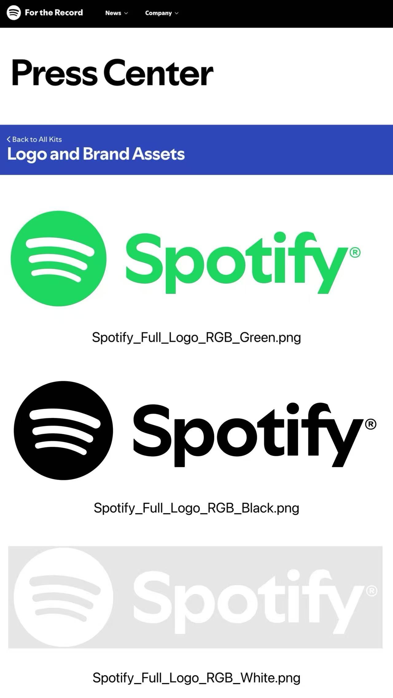
The lesson for a smaller product team is to name the use with the file. logo_primary_white.svg tells the editor more than logo-final.svg. Add a preview on the intended background and specify minimum clear space, placement, and whether animation may change the mark’s proportions.
A repeat video brief can then say:
| Brand input | Video decision |
|---|---|
| Primary white logo | End card over the dark product scene |
| Green logo | Light background only |
| Black logo | Product-page thumbnail or pale background |
| Icon mark | Small social corner placement, if legible |
Slack: Identity Across Logos, Type, and Illustration
Slack’s media kit offers logo files and product screenshots, then points to a wider Brand Center covering color, typography, writing, illustration, and more. That is a useful model for software and service brands whose videos must combine interface footage with identity elements.
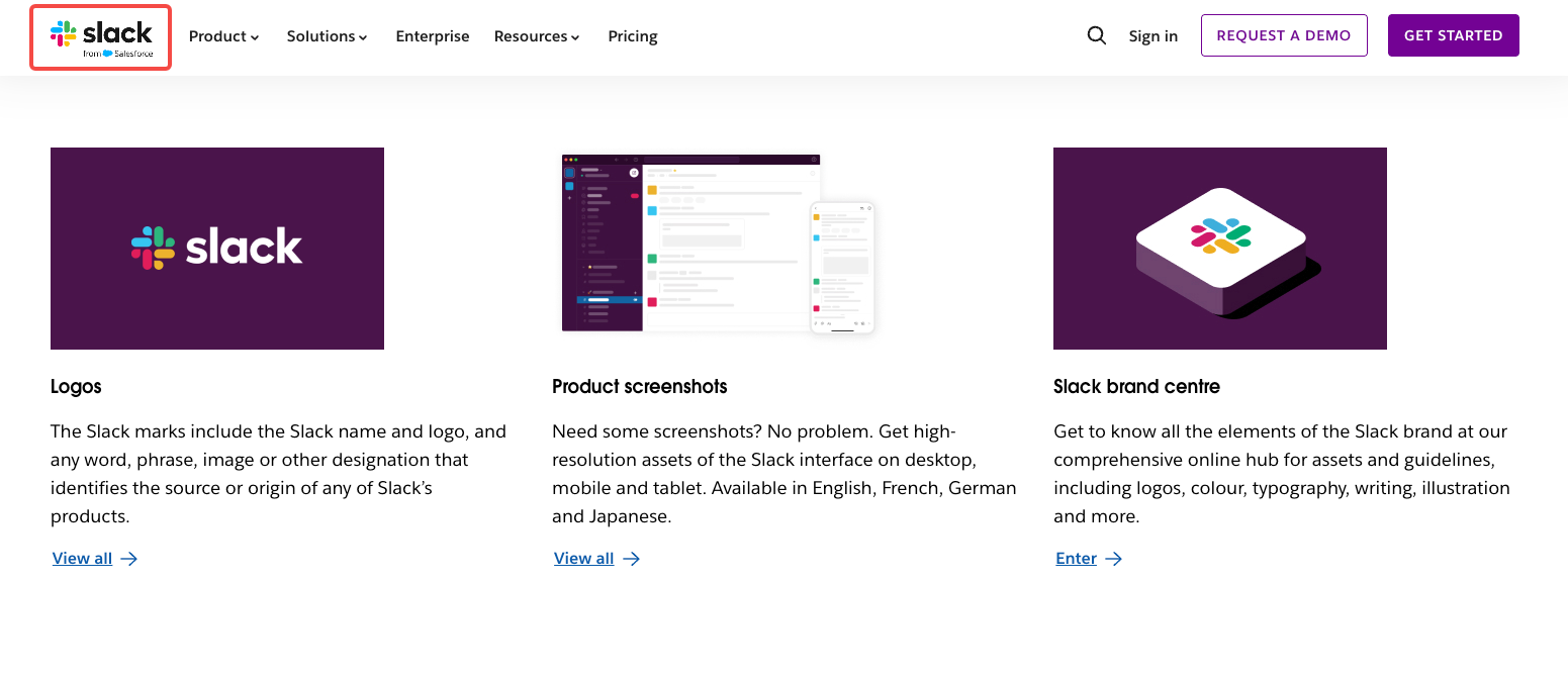
Separate the interface source from the visual treatment around it. A current screen recording supplies product truth. A color or illustration reference supplies mood. Neither should replace the other.
A Slack-style packet might include current desktop and mobile screenshots, the interface version or capture date, approved logo files, typography rules, illustration references, and a note identifying which screens are safe to show publicly.
That separation matters when the product changes quickly. An old interface frame can make an otherwise accurate video misleading.
Mailchimp: Character and Color Boundaries
Mailchimp’s brand-assets guidance makes small decisions visible. It specifies the spelling of “Mailchimp,” pairs the company name with the Freddie icon, identifies Cavendish Yellow as the hero color, and explains that the graphics are proprietary. The value of the page is its precision. It tells a repeat producer what the brand considers part of the identity system.

A smaller brand can borrow that precision without borrowing Mailchimp’s artwork. Write the name exactly as it should appear, name the approved mascot or character files, show the light and dark logo treatments, and describe where the main color belongs. If a character appears in a video, add pose, expression, crop, and animation boundaries to the kit.
Character rules should cover product proximity, claims, and customer photographs. Those are video decisions, not a vague “on brand” note.
A Video Input Checklist for a Small Product Team
Use this checklist for a monthly social campaign.
| Input | Fill in before production |
|---|---|
| Kit version | Name, version, date, and owner |
| Logo files | Exact filenames and approved backgrounds |
| Product references | Current SKU photos, packaging, labels, and variant list |
| Copy | Approved product name, claim, offer, and CTA |
| Type | Font files, license, fallback, and editable-text rule |
| Color | Values, contrast notes, and restricted combinations |
| Motion | Allowed logo animation, transitions, character movement |
| Reference-only files | Images that guide mood but cannot establish product facts |
| Prohibited elements | Outdated packaging, altered marks, unsupported claims |
| Review path | Brand approver, product approver, final approver |
| Delivery | Ratios, caption requirements, filenames, and destination |
A useful packet distinguishes “use in the video” from “use as visual reference.” That distinction is especially important for generated lifestyle images. A reference can guide lighting or composition while the real packshot controls the product’s shape, label, and color.
For a detailed Canva asset handoff, see Canva Craft Brand Assets: A Video Handoff Checklist. Once the packet is approved, Pexo’s create workspace can take the production brief.

What Must a Video Brief Decide Beyond the Brand Kit?
The kit defines the materials and rules. The brief decides what the viewer should see, hear, and do.
For each video, add the audience, one message, the product fact being demonstrated, the scene order, the CTA, the destination, the required ratios, and the acceptance criteria. State which image controls product appearance and which reference controls the setting. Name the person who can approve a claim change and the person who can approve a new logo animation.
A brand kit can say “use the primary logo.” The brief must say whether that logo appears at the opening, beside the product, or only in the final frame. A kit can list three product photos. The brief must choose the one that proves the scene’s action.
Conclusion
The best brand kit examples turn identity into repeatable production choices. Spotify shows how to separate logo variants. Slack shows why product screenshots need a wider system of type, illustration, and usage rules. Mailchimp shows the value of precise character and color boundaries.
A small product team can use the same logic. Version the files, identify the source of truth, separate references from usable assets, and let each video brief decide the story, action, and CTA.
This article does not provide legal advice. Confirm current brand guidelines, asset permissions, font licenses, and client agreements before using the kit in a published campaign.