
 ChatGPT
 Perplexity
 Claude
 Gemini
 Grok
Grok

How to Make a Kinetic Typography Explainer Video
UPDATED: 2026-08-10 By Lan He, Senior Video Producer at Pexo
Making a kinetic typography explainer takes six steps: confirm text-led fits, cut the script to frame-sized phrases, choose a typeface and hierarchy, time every word to the audio, animate with readable motion, then export. A kinetic typography explainer takes about 25 minutes when generated.
Quick Version: How to Make a Kinetic Typography Explainer Video
- Confirm the subject is verbal rather than visual.
- Cut the script so each frame holds three to seven words.
- Choose one typeface family with a clear weight hierarchy.
- Time every phrase to land with the narration.
- Animate so text stays readable while it moves.
- Export 16:9 for site and YouTube, 9:16 and 1:1 for social.
How to Make a Kinetic Typography Explainer Video Step by Step
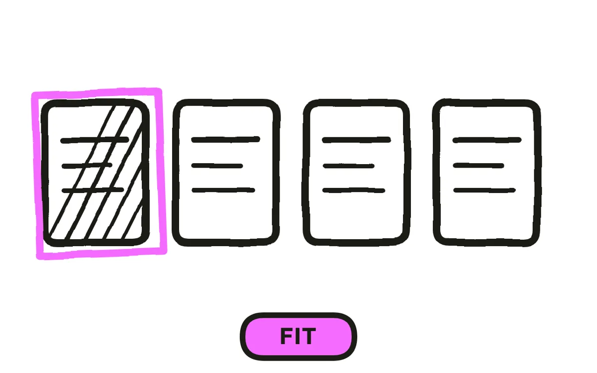
Step 1: Confirm text-led is the right choice
Kinetic typography suits subjects that are inherently verbal: a claim, a statistic, a quote, a comparison, a manifesto. The format works because reading a word land in rhythm is more forceful than hearing it alone.
It fails whenever there is something to show. A product, an interface, a process, or a place all lose from being reduced to their names in motion, and a viewer who needed to see the thing gets a slideshow of typography instead. Ask whether the content would survive being read aloud with no pictures. If yes, the format fits.
Step 2: Cut the script to frame-sized phrases
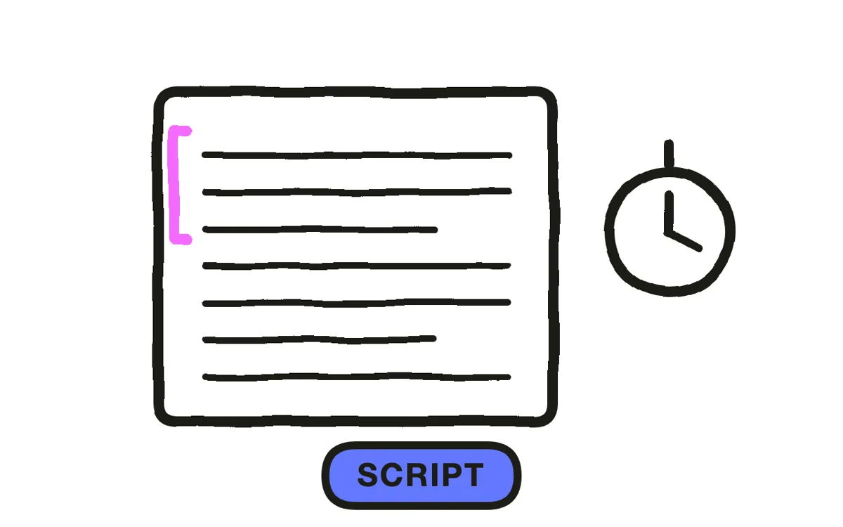
Write the narration first, then break it into what a frame can hold: three to seven words for a headline moment, one idea at a time. A frame carrying a full sentence has become a slide, and the motion then decorates text rather than delivering it.
Expect to cut hard. A script that reads well as prose usually carries too many qualifiers for this format, and the qualifiers are what push a frame from four words to twelve. Keep 30 to 90 seconds total, because constant text motion becomes tiring past that regardless of craft.
Step 3: Choose typeface and hierarchy
Pick one family and use weight for hierarchy: heavy for the emphasised word, regular for the rest. Mixing families is the fastest way to make a piece look assembled rather than designed, and in a format where type is the only visual there is nothing else to carry it.
Avoid thin weights entirely. They disappear at phone size, which is where most of this gets watched, and a kinetic typography piece whose supporting line is illegible has lost half its content. Set the smallest size against a phone screen rather than a desktop preview.
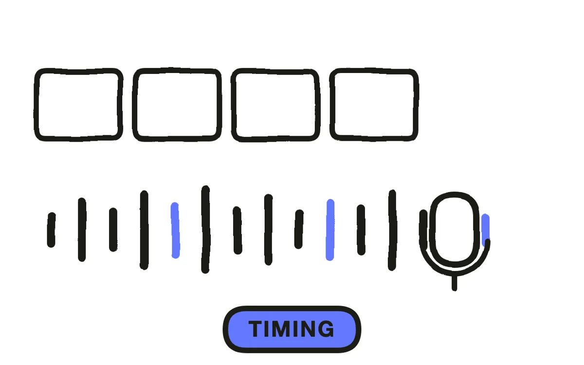
Step 4: Time every phrase to the audio
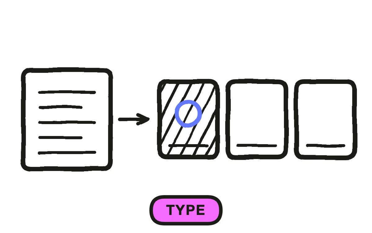
Record the narration before animating anything, then place each phrase to land on the word being spoken. This synchronisation is the entire format: text arriving slightly off the voice reads as broken in a way viewers notice without being able to name.
Hold each key phrase at least a beat past when it is spoken. Text that leaves as the voice finishes gives the viewer no time to read it, which defeats the purpose of showing it. When in doubt, hold longer, because the cost of a slightly slow frame is far lower than the cost of an unread one.
Step 5: Animate so text stays readable
Ease every entry and exit. Text that snaps into place at constant speed reads as a template, and in a format built entirely on type that tell is unmissable.
Move the frame rather than the letters where possible: a camera push across a laid-out phrase is easier to read than letters flying in individually. Reserve per-letter animation for the two or three words that carry the most weight, since it costs legibility everywhere it is used.
Pexo's text-to-video workflow generates kinetic typography sequences from a script, applying easing and timing without per-word keyframing.
Step 6: Export and check muted
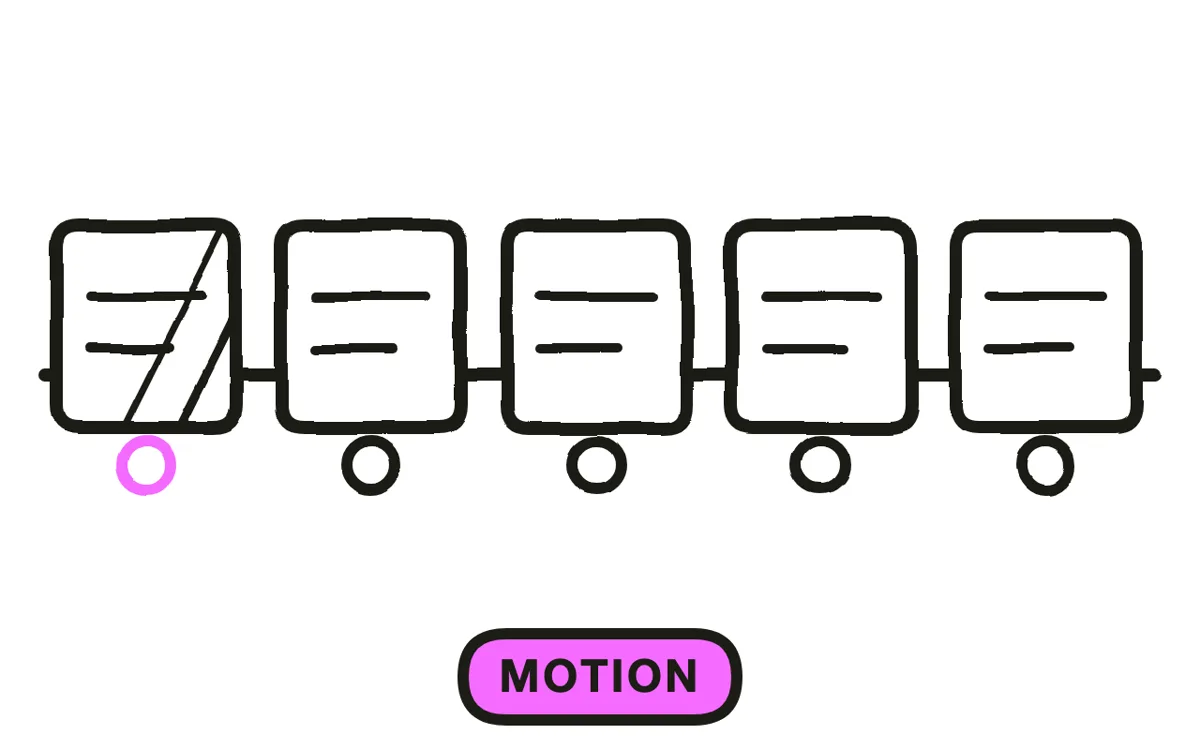
Export 16:9 at 1080p for a website and YouTube, 9:16 for Reels, TikTok, and Shorts, and 1:1 for feeds. Vertical suits this format unusually well, because short lines fill a tall frame naturally rather than needing recomposition. Pexo exports all three from one project.
Watch every export muted before publishing. A kinetic typography piece timed to narration can become unreadable without it, since the holds were set against a voice the viewer cannot hear. If the muted version does not work, lengthen the holds rather than assuming sound will be on.
How to Make a Kinetic Typography Explainer Video with Pexo
The six steps above work with any tool. Pexo handles steps 5 and 6 in a single conversation, which removes the per-word keyframing that makes this format slow by hand.
Open the motion graphics page and describe the piece: "A 45-second kinetic typography explainer on why most onboarding emails go unread, one heavy sans-serif family, charcoal and amber, four words per frame, timed to a calm narration." Pexo builds the sequence, times the phrases, and exports every ratio.
Adjust any segment by describing the change in the chat, and Pexo regenerates that section alone. The platform runs across Seedance 2.0, Kling AI, and more.
For related formats, the motion graphics explainer tutorial covers data and shapes alongside type, and infographic explainer covers number-led pieces.
5 Mistakes That Make Kinetic Typography Unreadable
1. Using it for something with a physical form. A product reduced to its name in motion loses everything a picture would have carried.
2. Full sentences in a frame. Once a frame holds a sentence it is a slide, and the animation is decorating text rather than delivering it.
3. Thin weights. They vanish at phone size, and the supporting line is usually the part that qualifies the claim.
4. Text leaving as the voice finishes. The viewer never gets time to read it. Hold a beat longer than feels necessary.
5. Per-letter animation everywhere. It costs legibility every time it is used. Reserve it for two or three words.
Related Tutorials
- How to make a motion graphics explainer video for type plus data and shapes
- How to make an infographic explainer video for number-led explanation
- How to make a motion graphics explainer video for the broader format
- How to make a 2D explainer video for image-led animation