

 ChatGPT
 Perplexity
 Claude
 Gemini
 Grok
Grok

How to Make an Infographic Explainer Video
UPDATED: 2026-08-06 By Lan He, Senior Video Producer at Pexo
Making an infographic explainer video takes six steps: isolate one finding, choose chart forms that match the comparison, plan the reveal sequence, produce the animation, add sound on each value, then export. An infographic explainer video takes about 25 minutes to produce.
Quick Version: How to Make an Infographic Explainer Video
- Isolate the one finding the data actually supports.
- Choose a chart form that matches the comparison being made.
- Plan a reveal sequence that builds an argument.
- Produce the animation without keyframing every value.
- Put a sound on each value as it lands.
- Export 16:9 for site and YouTube, 9:16 and 1:1 for social.
How to Make an Infographic Explainer Video Step by Step
Step 1: Isolate one finding
Write the single sentence the data supports: "support tickets fell by a third after the redesign, and the drop came entirely from password resets." Not "here is our annual support data", which is a dataset rather than a finding.
Keep three to five data points. Each needs three to five seconds to be read and understood, and a viewer carrying six figures retains none of them. Choose the numbers that carry the finding and link to the full report for everything else.

Step 2: Choose chart forms that match the comparison
Match form to comparison rather than to what looks impressive. Bars compare categories. Lines show change over time. A single large figure with context beneath it beats a chart when there is only one number that matters.
Avoid pie charts in video specifically. Reading angle is already harder than reading length, and animating segments into place makes it harder still. If the point is parts of a whole, a stacked bar or a set of labelled figures communicates it in a fraction of the time.
Step 3: Plan the reveal sequence
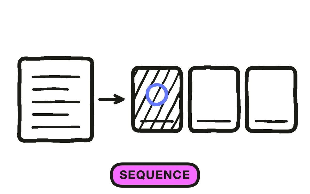
Reveal one series at a time and let each value settle before the next begins. A chart where everything grows at once is decoration; one that builds in sequence is an argument the viewer can follow, and the order you choose is what makes the point.
Show the baseline first, then the change. Establishing what normal looks like before showing the deviation is what makes a number meaningful, and it is the step most data videos skip. Keep axes and layout stable as the chart builds, since a rescaling axis mid-reveal destroys the comparison the viewer was making.
Step 4: Produce the animation
Hand-animating data in After Effects means keyframing every bar, every label, and every axis, which is why most data ends up as a static image with a voiceover instead.
Pexo's text-to-video workflow generates animated data sequences from a description, with consistent typography and palette across the piece. Keep the honesty checks manual regardless of tool: value axes starting at zero unless stated otherwise, visual size proportional to the number, and sample size and period on screen. Motion makes a distorted axis considerably more persuasive than it is on paper.
Step 5: Put a sound on each value
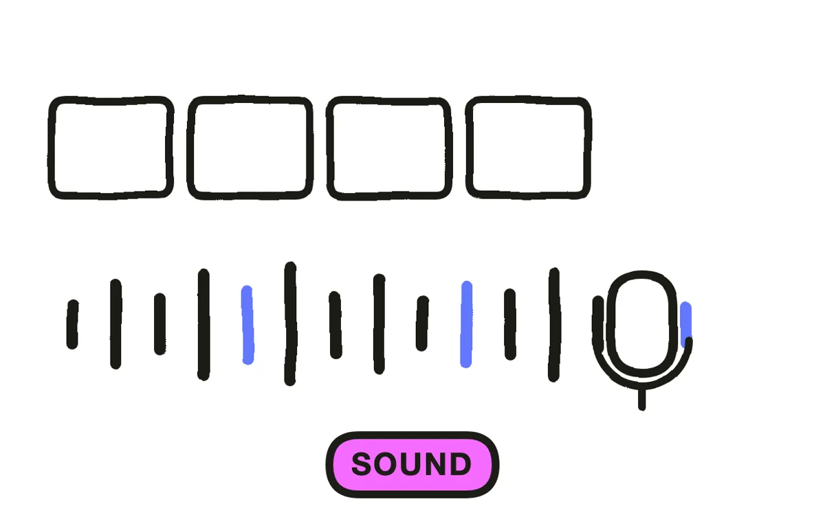
Give every value a cue as it lands: a soft tick, a tonal note, a low hit on the headline figure. Sound synchronised to data reveals roughly doubles the perceived production value of the identical sequence played silently, and it marks where the viewer should look.
Cite the source on screen in small type, held long enough to read. An unattributed statistic loses exactly the reader who cares about the number, and attribution costs one line. Pexo composes a score aligned to the reveal beats during production.
Step 6: Export for your placement
Export 16:9 at 1080p or higher for a website, report landing page, and YouTube. Export 9:16 for Reels, TikTok, and Shorts. Export 1:1 for feed posts.
Pexo exports all three ratios from one project. Lay charts out for vertical rather than cropping, since a centre crop of a bar chart removes the axis that made it readable. Check every export on a phone: the qualification under a headline figure is the first thing to become illegible, and it is often the part keeping the number honest.

How to Make an Infographic Explainer Video with Pexo
The six steps above work with any tool. Pexo handles steps 4 through 6 in a single conversation, which removes the keyframing that keeps most data as a static image.
Open the infographic animation page and describe the piece: "A 45-second infographic explainer showing support tickets falling 33 percent after a redesign, three bars revealed in sequence, navy and amber palette, source line on screen, no narration." Pexo builds the animation, times the reveals, scores it, and exports.

Adjust any chart by describing the change in the chat, and Pexo regenerates that segment alone. The platform runs across Seedance 2.0, Kling AI, and more.
For related formats, the motion graphics page covers typography-led explanation and educational video covers teaching content.
5 Mistakes That Make Data Animation Meaningless
1. Presenting a dataset instead of a finding. "Here is our annual data" is not an argument. One sentence, three to five numbers.
2. Animating the whole chart at once. Simultaneous growth is decoration. Sequential reveals are the argument.
3. Pie charts in motion. Angles are hard to read still and harder moving. Use bars or labelled figures.
4. Skipping the baseline. A number means nothing until the viewer knows what normal looked like.
5. No source on screen. An unattributed statistic loses exactly the viewer who cared about it, and citing it costs one line.
Related Tutorials
- How to make a motion graphics explainer video for typography-led explanation
- How to make an education explainer video for teaching concepts
- How to make a 2D explainer video for the general animated format
- How to make a tech explainer video for technical systems