

 ChatGPT
 Perplexity
 Claude
 Gemini
 Grok
Grok

How to Make a Motion Graphics Explainer Video
UPDATED: 2026-08-06 By Lan He, Senior Video Producer at Pexo
Making a motion graphics explainer video takes six steps: define one message, script it for typography and data, build style frames, apply the animation principles, add sound, then export. A motion graphics explainer takes about 25 minutes when generated, or days by hand.
Quick Version: How to Make a Motion Graphics Explainer Video
- Define the single message the piece delivers.
- Script it so typography and data carry the explanation.
- Build style frames locking type scale, palette, and grid.
- Apply easing, overlap, and anticipation instead of linear motion.
- Add sound timed to each element entry.
- Export 16:9 for site and YouTube, 9:16 and 1:1 for social.
How to Make a Motion Graphics Explainer Video Step by Step
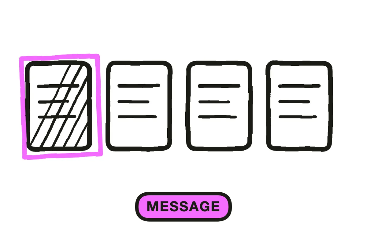
Step 1: Define one message
Write the single statement the piece exists to deliver. Motion graphics fail most often from carrying too much: four statistics, three claims, and a logo in ninety seconds leaves the viewer holding none of them.
Confirm the format fits. Motion graphics suit explanations built on numbers, comparisons, and abstract relationships. If the story is really about a person's frustration, character animation carries it better, and no amount of typographic craft substitutes for that.
Step 2: Script for typography and data
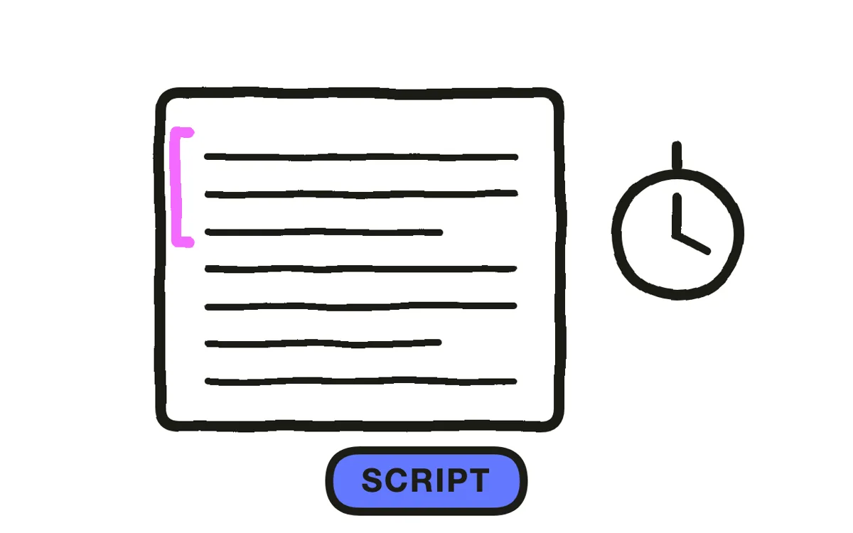
Write at roughly 150 words per minute if there is narration, and mark for every line what appears on screen. In this format the on-screen text is not a caption of the voiceover; it is the argument, and the voice supports it.
Cut the sentence down to what fits a frame. "Teams using automated reconciliation closed their books 40 percent faster" is a narration line; on screen it becomes "40% faster close" with the qualification beneath. Text sized for a desktop preview routinely becomes unreadable in a phone feed, which is where most of this gets watched.
Step 3: Build style frames
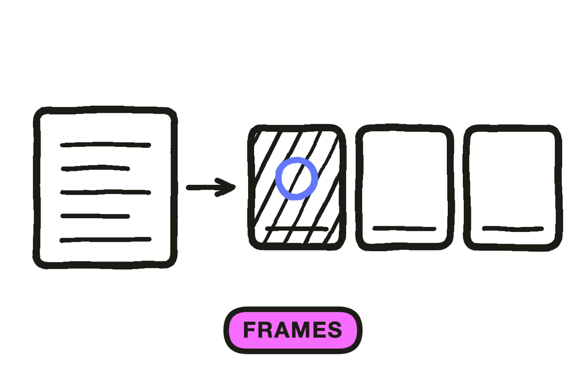
Design two or three static frames representing key moments before animating anything. Lock the typeface, the type scale, the palette, the spacing, and the layout grid. Motion amplifies design decisions rather than rescuing them.
Set the smallest type size against the smallest screen the piece will play on, not against your monitor. A supporting line that reads comfortably at desktop size disappears at phone size, and the qualification is usually the part that keeps a statistic honest.
Step 4: Apply the animation principles
Ease every movement. Elements that accelerate out of stillness and decelerate into place read as designed; constant-speed motion reads as a template. This single decision accounts for most of the visible gap between professional and amateur work in this format.
Overlap the timing, offsetting entries by a few frames rather than firing them together. For data, reveal one series at a time and let each value settle before the next begins: a chart where every bar grows at once is decoration, while one that builds in sequence is an argument.
Pexo's text-to-video workflow generates motion graphics sequences with consistent typography and palette, applying easing and overlap without keyframing.
Step 5: Add sound timed to the motion
Put a sound on each significant element entry: a click, a soft whoosh, a tonal note. Motion graphics with synchronised sound read as roughly twice the production value of the identical sequence played silently.
Place one emphasis on the key statement and keep everything else restrained. Then check the piece muted, since most social playback is silent and the sequence has to hold on visual timing alone. Pexo composes a score aligned to the motion beats during production.
Step 6: Export for your placement
Export 16:9 at 1080p or higher for a website, YouTube, and presentations. Export 9:16 for Reels, TikTok, and Shorts. Export 1:1 for feed posts.
Pexo exports all three ratios from one project. Lay out the vertical version rather than cropping the landscape one: motion graphics compositions depend on the spatial relationships between elements, and a centre crop discards exactly those. Check every export on a phone before publishing.
How to Make a Motion Graphics Explainer Video with Pexo
The six steps above work with any tool. Pexo handles steps 4 through 6 in a single conversation, which compresses the keyframing that otherwise takes days.
Open the motion graphics page and describe the piece: "A 75-second motion graphics explainer on how a payments reconciliation tool cuts close time, bold sans-serif typography, navy and lime palette, three statistics revealed in sequence, ending on the logo." Pexo builds the sequence, applies easing and overlap, scores it, and exports.

Adjust any segment by describing the change in the chat, and Pexo regenerates that section alone. The platform runs across Seedance 2.0, Kling AI, and more.
For other styles, the 2D explainer video page suits character-led stories, infographic animation covers data-heavy pieces, and whiteboard animation covers hand-drawn explanation.
5 Mistakes That Make Motion Graphics Unreadable
1. Linear movement. Constant-speed motion is the clearest amateur signal. Ease everything.
2. Text that moves faster than it can be read. You have seen it twenty times; the viewer has not. Two seconds minimum for a short line.
3. Sizing type against a desktop monitor. The qualification under a statistic is usually the first thing to vanish at phone size, and it is the part that keeps the number honest.
4. Animating a whole chart at once. Simultaneous bars are decoration. Sequential reveals are an argument.
5. Carrying four messages. The viewer retains none of them. One message per piece.
Related Tutorials
- How to make motion graphics for the broader motion graphics format
- How to make a 2D explainer video for character-led explanation
- How to make a whiteboard animation for hand-drawn explanation
- How to produce an explainer video for the full production process