
 ChatGPT
 Perplexity
 Claude
 Gemini
 Grok
Grok

How to Make an Isometric Explainer Video
UPDATED: 2026-08-10 By Lan He, Senior Video Producer at Pexo
Making an isometric explainer takes six steps: confirm the angle fits, build the scene as one system, script against a visible whole, plan camera moves that keep the geometry, animate, then export. An isometric explainer takes about 25 minutes when generated.
Quick Version: How to Make an Isometric Explainer Video
- Confirm the subject is a system with parts that connect.
- Build one scene that reads as a whole, not assorted objects.
- Script against a view where everything is visible at once.
- Plan moves that keep the isometric angle locked.
- Animate the connections rather than the objects.
- Export 16:9 for site, rebuild vertically for social.
How to Make an Isometric Explainer Video Step by Step
Step 1: Confirm the angle fits
Isometric shows the top and two sides of everything at once, with no vanishing point, so the far end of a system stays as readable as the near end. That suits infrastructure, networks, workflows crossing teams, and anything where the relationship between parts is the actual subject.
It works against you whenever a person's experience is the point. The angle holds everything at a fixed distance, which is what makes it good for systems and wrong for feelings. Ask whether the viewer needs to understand a structure or empathise with someone.
Step 2: Build one scene
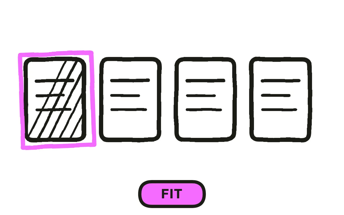
Design a single continuous scene rather than a series of separate illustrations. The format's advantage is that the whole system exists in one space, and cutting between unrelated isometric vignettes throws that away while keeping all of the style's stiffness.
Limit the palette to three to five colours and reserve one for whatever is being explained right now. In a frame where everything is visible simultaneously, colour is the only reliable way to say "look here", and a scene without that reserve becomes a pretty picture the viewer scans aimlessly.
Step 3: Script against the visible whole
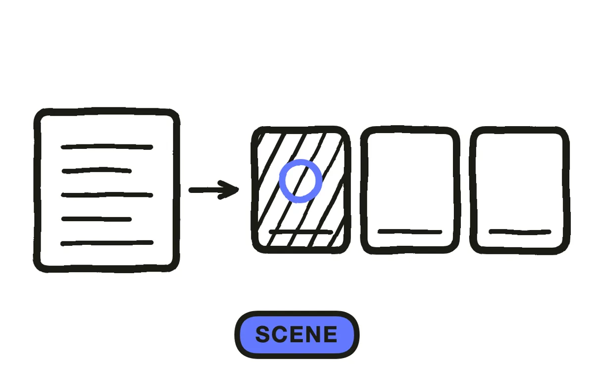
Write knowing the viewer can already see the entire system. That changes the script: instead of introducing each part, you are directing attention around something already on screen, which reads more like a tour than a reveal.
Keep it to 60 to 90 seconds at 130 to 150 words per minute, slower than conversational. A dense frame needs time, and the most common pacing error here is narrating at normal speed over a scene that takes four seconds to read.
Step 4: Plan moves that keep the geometry
Slow pans, pushes, and orbits all work provided the angle stays locked. What breaks the format is tilting off the isometric axis: the instant parallel lines converge, the style reads as a mistake rather than a decision, and it is unrecoverable in the same shot.
Move slowly. The whole point of the angle is that a viewer can read relationships, and a camera crossing the scene in under two seconds gives them no chance to. Long, slow moves over few shots beat a conventional cutting rhythm here.
Step 5: Animate the connections
Animate what moves between the parts rather than the parts themselves: a packet along a line, a box down a conveyor, a request crossing from one team's block to another. Isometric objects mostly look wrong when they move; the flow between them looks right.
Pexo's text-to-video workflow generates isometric scenes and their motion from a description, which removes the grid setup and per-object rigging that makes this style slow to build by hand.
Step 6: Export per placement
Export 16:9 at 1080p or higher for a website, sales decks, and YouTube. Isometric scenes are wide by nature and this is their home ratio.
For 9:16, rebuild the scene vertically rather than cropping. A cropped isometric frame loses exactly the relationships that justified using the angle, leaving a stylised picture of some blocks. Pexo exports each ratio from one project.

How to Make an Isometric Explainer Video with Pexo
The six steps above work with any tool. Pexo handles steps 5 and 6 in a single conversation, which removes the isometric grid work that makes this style expensive by hand.
Open the animated explainer video page and describe the piece: "A 75-second isometric explainer showing an order moving from warehouse to courier to doorstep, one continuous scene, four-colour palette with orange for the active step, slow locked-angle push, calm narration." Pexo builds the scene, animates the flow, and exports.
Adjust any part of the scene by describing the change in the chat, and Pexo regenerates that section alone.
For related styles, the infographic animation page covers data-led explanation and how it works video covers process explanation.
5 Mistakes That Flatten an Isometric Video
1. Tilting off the axis. The moment parallel lines converge, the style reads as an error rather than a choice.
2. Cutting between separate vignettes. It discards the one-continuous-system advantage while keeping all the stiffness.
3. Moving the camera fast. A viewer needs seconds to read a dense frame, and a two-second traverse gives them none.
4. No reserved colour. In a frame where everything is visible, colour is the only way to direct attention.
5. Animating the objects. Isometric objects look wrong in motion; the flow between them is what should move.
Related Tutorials
- How to make an infographic explainer video for data-led explanation
- How to make a 3D explainer video for the perspective alternative
- How to make a motion graphics explainer video for the broader animated style
- How to make a tech explainer video for technical systems